Designing a Poster That Captures the Spirit of Your Eisteddfod
A successful eisteddfod poster does more than announce a date and venue. It gives people an immediate sense of the occasion: the sound of voices joining in song, the movement of dancers, the colour of Welsh costume, and the welcome of a community gathering together. Before anyone reads the full programme, the design should make the event feel distinctive and worth attending.
For local organising committees, a poster is often the most visible part of an event’s marketing. It may appear in a village shop, school entrance, library, community hall, social media feed, or shop window. A clear and memorable design helps the eisteddfod travel beyond its usual audience while respecting the traditions that make it special.
The strongest posters balance heritage with energy. They use familiar cultural references without becoming crowded or old-fashioned, and they provide practical information without allowing the details to overwhelm the personality of the event.
Start With The Character Of The Eisteddfod
Before choosing colours or fonts, decide what your eisteddfod should feel like. Is it a lively children’s festival, a traditional community competition, a celebration of music and dance, or a broad programme bringing several generations together? The answer will guide every visual decision.
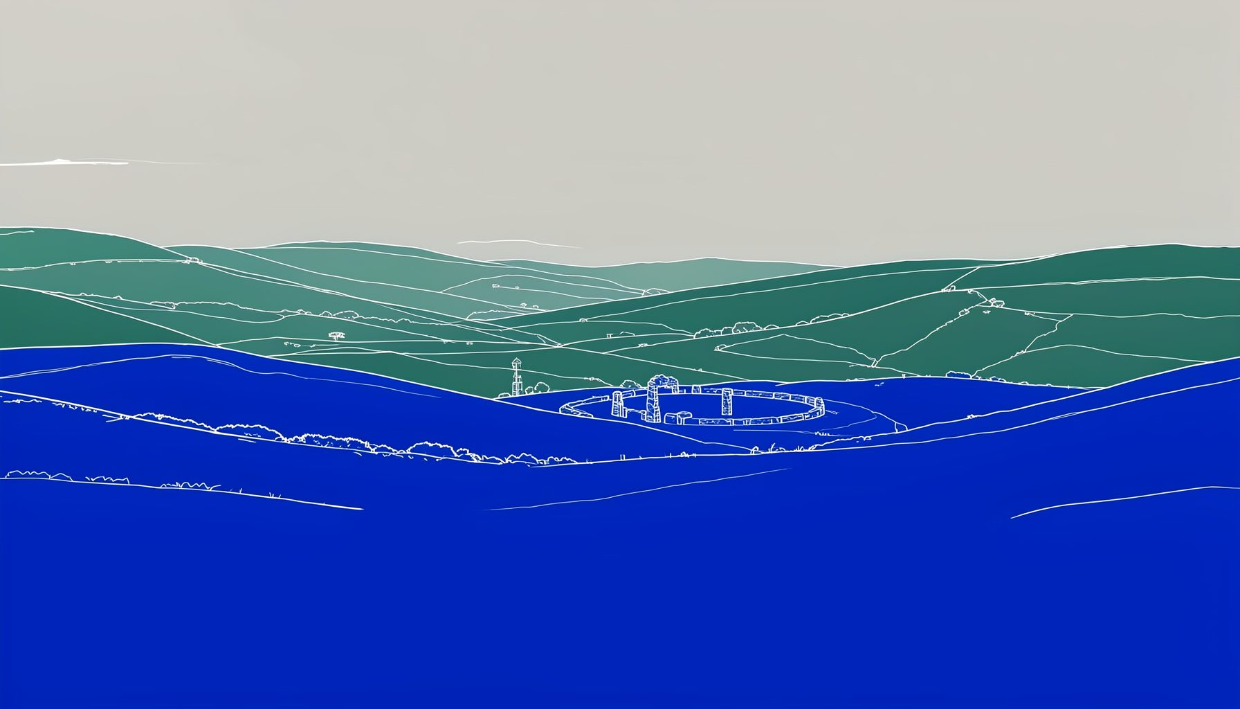
A rural eisteddfod might draw inspiration from local hills, rivers, farms, chapels, or village architecture. An urban event could reflect street patterns, community murals, or the character of its neighbourhood. The poster does not need to show every aspect of the programme. One strong local connection is often more effective than a collection of unrelated images.
Consider writing three or four words that describe the event. “Warm, lively, traditional, welcoming” will lead to different choices from “bold, youthful, contemporary, ambitious.” Share these words with the organising committee so that everyone has a common reference when reviewing early designs.
The event’s purpose should also influence its tone. A poster promoting folk singing and cerdd dant may benefit from a more lyrical composition, while a youth-focused festival can use brighter colour contrasts and more playful shapes. Tradition provides the foundation, but the design should show that the eisteddfod is a living part of Welsh culture.
Build A Visual Language With Welsh Roots
Colour can establish atmosphere before a single word is read. Deep red, green, slate, cream, and warm gold can suggest Welsh landscapes and heritage, while brighter shades may give a family or school eisteddfod a more energetic appearance. Choose a small palette and use it consistently rather than filling the page with every colour associated with Wales.
Images and symbols should be selected with care. A harp, ribbon, daffodil, musical note, or stylised dragon can work well when used sparingly, but familiar symbols become less powerful when several compete for attention. Local motifs are especially valuable because they make the poster feel created for a particular community rather than adapted from a generic festival template.
Typography also carries cultural meaning. A traditional serif typeface can give the event a sense of continuity, while a clean sans-serif font can make information easier to read and bring a modern balance. Avoid decorative lettering for essential details such as dates, times, and registration instructions. Characterful display type belongs in the title; clarity belongs in the supporting text.
If the eisteddfod has an established logo, colour scheme, or annual visual identity, treat it as a starting point. A new poster should feel connected to previous events while still giving this year’s programme its own character. Consistency helps families, performers, teachers, and supporters recognise official communications quickly.
Make The Main Message Impossible To Miss
A viewer should understand the event within a few seconds. The eisteddfod name, date, location, and central invitation should have an obvious visual hierarchy. If the eye cannot find these details immediately, the poster is asking too much from its audience.
A useful structure is to place the event name at the top, give the date and venue strong prominence, and position programme highlights beneath them. Registration information, ticket details, contact details, and sponsor acknowledgements can sit lower on the page in a smaller but still readable size.
Keep the wording active and welcoming. Phrases such as “Celebrate Welsh song, dance, and tradition” or “A day of music, performance, and community” communicate atmosphere while remaining concise. If the event is open to families, new performers, or local schools, say so directly.
The following hierarchy can help committees assess whether a draft gives each piece of information the right weight:
| Poster element | Purpose | Recommended treatment |
|---|---|---|
| Eisteddfod name | Identifies the event | Largest text, distinctive type |
| Date and venue | Enables attendance | High contrast and easy to scan |
| Main invitation | Creates interest | Short, warm, active wording |
| Programme highlights | Shows what to expect | Brief list or grouped phrases |
| Booking or registration details | Supports action | Clear placement near the bottom |
| Logos and acknowledgements | Recognises partners | Smaller, aligned, and uncluttered |
Read the poster from a distance and then at arm’s length. If the date disappears into the background or the venue is hidden among decorative elements, revise the layout. A beautiful poster that fails to communicate basic information is still an ineffective poster.
Use Movement, Sound, And People
An eisteddfod is a live experience, so a static design should suggest movement and sound. Curving lines can echo a melody, layered shapes can suggest many voices, and repeated forms can create the rhythm of dancing feet. These devices can make the poster feel active without relying on a crowded photograph.
People are often the most compelling visual element. A carefully chosen image of young singers, dancers in motion, musicians preparing to perform, or an audience sharing a moment can communicate welcome and participation. Whenever children or identifiable individuals appear, obtain the appropriate permissions and make sure the image reflects the event’s values.
Avoid using photographs that are too dark, distant, or busy. A single expressive image usually works better than a collage of small pictures. If no suitable photography is available, consider commissioned illustration, simple line drawings, cut-paper shapes, or abstract forms based on traditional patterns.
The poster can also point towards the wider cultural programme. If the eisteddfod includes an activity introducing children to instruments, a Welsh instrument workshop may provide both useful promotional context and a strong visual theme. The important point is to show that the event welcomes participation, learning, and discovery alongside competition.
Design For Print, Screens, And Shared Spaces
A poster that looks impressive on a designer’s monitor may become unreadable when printed in a small community noticeboard format. Test the design at the size people will actually see. Check whether the smallest text remains legible, whether colours retain enough contrast, and whether important details sit safely inside the trim area.
Create versions for the places where the poster will appear. A large A3 print can carry more supporting information than an A4 sheet, while an Instagram post or story needs a layout suited to a phone screen. A digital version should also remain clear when shared through messaging groups, where it may be viewed as a small preview.
Accessibility should shape the design from the beginning. Avoid placing text over complex photographs, use strong contrast, and do not communicate information through colour alone. Consider people with visual impairments, older readers, and anyone viewing the poster quickly in a busy public space.
File preparation matters too. Keep an editable master file, export a high-resolution PDF for professional printing, and create compressed image files for social media. Confirm the printer’s requirements before sending the final artwork. A short technical check can prevent clipped logos, missing fonts, or dull colours.
Refine The Poster With Community Insight
The organising committee should review an early draft before the design becomes too fixed. Invite people who represent different parts of the audience, including performers, teachers, parents, volunteers, and older community members. Ask them what they notice first, what they think the event offers, and whether any key information is difficult to find.
Feedback is most useful when it focuses on purpose rather than personal taste. Instead of asking whether someone “likes” a colour, ask whether the colour supports the event’s character and keeps the text readable. Instead of collecting many individual preferences, return to the agreed words that describe the eisteddfod.
A final proof should check spelling, accents, bilingual wording, dates, times, venue details, web addresses, ticket instructions, and sponsor names. Welsh and English text should be treated with equal care, with enough space for both languages to remain comfortable and clear. If one language is visually compressed, the design may feel unbalanced even when all the information is technically present.
Use this short review before approval:
- Check that the event name, date, time, and venue can be read immediately.
- Confirm that Welsh and English wording is accurate, consistent, and equally visible.
- Test the poster in print, on a phone, and from several steps away.
- Remove decorative elements that compete with the main message.
- Save accessible, print-ready, and social media versions separately.
A calm review process protects the poster from last-minute clutter. It also gives volunteers and partners confidence that the information they share is accurate and official.
Turn One Strong Design Into A Campaign
The poster should form the centre of a wider communications set. Adapt its colours, typefaces, image, and key message for social media graphics, programme covers, email headers, tickets, school notices, and sponsor materials. Repeating the same visual language helps people recognise the event wherever they encounter it.
Plan the release around the audience’s decisions. Announce the date early, follow with registration or ticket information, and then share programme highlights as they are confirmed. A series of related graphics can maintain interest more effectively than publishing one poster and leaving it unchanged for several months.
Community distribution is just as important as digital reach. Ask schools, libraries, Welsh-language organisations, chapels, shops, arts groups, and local businesses to display or share the design. Provide a short accompanying message so that volunteers know what to say when they post it online or recommend the event in person.
After the eisteddfod, keep a record of where the poster appeared and which versions were used. Note questions that people asked, information they missed, and formats that partners found easiest to share. These observations will help future committees build on what worked while keeping each annual design fresh.
A thoughtful poster can become part of the memory of an eisteddfod. When its words, images, and colours express the community behind the event, it does more than promote a programme: it invites people to take part in the continuing story of Welsh music, dance, language, and fellowship. Begin with the character of your own eisteddfod, shape that identity into a clear visual message, and share it widely so that more people can find their way to the celebration.