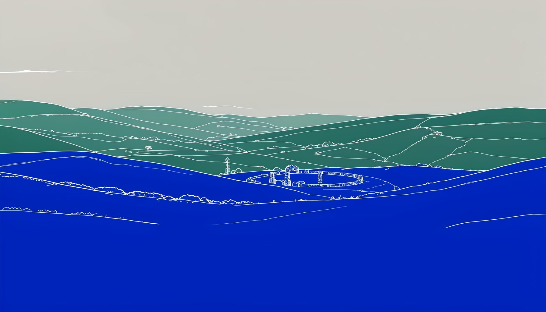
Designing Eye-Catching Posters for Your Local Event
A well-designed poster can turn a date on the community calendar into an event people remember. For a local eisteddfod, it needs to do more than announce a venue and start time: it should communicate the character of the day, celebrate Welsh culture, and give families, performers, and supporters a reason to take notice.
The strongest event posters are clear at a glance and rewarding when viewed more closely. A passer-by should understand what is happening within a few seconds, while a closer reader should find every practical detail needed to attend, enter a competition, or share the information with someone else.
Good design does not require expensive software or specialist training. With a focused message, a consistent colour scheme, readable type, and carefully chosen images, an organising committee can create an effective poster that works on a noticeboard, a phone screen, a social media feed, and a printed programme.
Start With The Event’s Character
Before choosing fonts or images, decide what the poster should make people feel. A children’s eisteddfod may need a bright, welcoming mood, while a long-established rural festival might benefit from a more traditional and rooted visual style. The design should reflect the event rather than applying a generic template.
Write down the essential identity of the occasion. Consider whether it is competitive, celebratory, family-focused, bilingual, informal, or connected to a particular village, chapel, school, or community hall. These qualities can guide every later decision, from photography and illustration to the balance between contemporary and traditional design.
A local event also has an advantage that a large commercial festival may lack: personal meaning. A familiar hall, a sketch of the village, a woven pattern, or an image of young performers can make the poster feel like it belongs to the community. Use local references with care, keeping the design distinctive without allowing decoration to compete with the key information.
Create A Clear Reading Order
Poster viewers usually scan rather than read from beginning to end. Establish a visual hierarchy so that the most important details appear first. The event name should be prominent, followed by the date, location, and a concise description of what attendees can expect.
Use size, weight, spacing, and placement to show the relationship between pieces of information. A large title, a medium-sized date, and smaller supporting details create a natural path through the design. Avoid making every word bold or oversized, because equal emphasis leaves viewers unsure where to look.
A useful structure might place the event name at the top, a strong image or illustration in the centre, and practical information in a clearly separated lower section. Include entry deadlines, ticket details, contact information, and accessibility notes only when they are relevant. If the poster becomes crowded, direct people to a website or social media account for extended information.
Short wording usually has greater impact. “A day of Welsh song, dance, and tradition” may work better than a long paragraph explaining the event’s history. Proofread every date, time, place name, and web address before printing. A beautiful poster with an incorrect start time can cause more confusion than a plain poster with accurate information.
Choose Colour, Type, And Imagery
Colour is one of the quickest ways to establish recognition. Choose two or three main colours and use them consistently across the poster, digital graphics, tickets, and programme cover. Colours inspired by the Welsh landscape, local buildings, traditional textiles, or the event’s existing identity can create a strong connection with place.
Contrast matters more than complexity. Dark text on a light background, or light text on a dark panel, is easier to read from a distance. Be cautious with red and green combinations, pale lettering over photographs, and decorative typefaces that lose clarity when reduced. A simple palette with one accent colour often looks more professional than a crowded mix of bright shades.
Typography should support the mood while remaining accessible. Pair a distinctive display font for the title with a clean sans-serif or readable serif for details. Limit the design to two type families and avoid using several decorative styles together. Welsh-language text may require careful font selection, so check that accents and characters display correctly.
Photography can give an event poster immediate warmth, especially when it shows real local performers, dancers, musicians, or families. Always obtain appropriate permission before using identifiable people, particularly children. If suitable photography is unavailable, consider a bold illustration, a simple line drawing, a paper-cut effect, or a pattern based on Welsh craft traditions.
Plan For Bilingual Communication
For many Welsh communities, language is part of the event’s identity and should be considered at the beginning of the design process. Bilingual information should feel balanced and intentional, rather than looking as though one language has been added as an afterthought.
Decide how the Welsh and English versions will be arranged. They may appear together line by line, in separate blocks, or on opposite sides of a folded or two-sided design. The best arrangement depends on the amount of text, the audience, and the poster’s physical size. Keep the order consistent across related materials so that people recognise the event quickly.
Translation should be checked by a confident Welsh speaker familiar with the local context. Literal wording can sometimes sound unnatural, while small errors in place names or event terminology may undermine trust. Leave enough room for both languages instead of shrinking the font until the poster becomes difficult to read.
Traditional forms such as folk singing, folk dancing, and cerdd dant can be represented through movement, rhythm, texture, or carefully selected symbols. A pattern inspired by a harp string, a stylised ribbon, or repeated shapes suggesting dance steps may communicate heritage without filling the page with clichés. Cultural references are most effective when they are relevant to the event and treated with respect.
Match The Design To Its Format
A poster designed for an A3 noticeboard will not automatically work as an Instagram post or a phone-screen graphic. Prepare the layout for each place where it will appear. Printed posters need enough detail to be read at a sensible distance, while digital versions need strong contrast and a composition that survives a smaller display.
Use high-resolution images and export print files at an appropriate quality. Ask the printer whether they require bleed, crop marks, or a particular colour format. Keep important text away from the edges, where it might be trimmed or hidden by a frame. Print one sample before ordering a large quantity and inspect it in the kind of setting where it will be displayed.
For social media, create a square or vertical version with fewer words and a stronger central image. Make sure the date and event name remain visible in a small preview. A digital poster can include a short web address or a scannable code, but the essential information should still be readable without clicking.
Think about where the physical posters will go. A noticeboard outside a school, a shop window, a library, and a village hall each offer different viewing conditions. A poster placed beside many others needs a strong silhouette, clear lettering, and a recognisable colour combination so that it can compete for attention without becoming visually noisy.
The following choices can help an organising committee adapt its design to different communication needs:
| Design Element | Printed Noticeboard Poster | Social Media Graphic | Practical Consideration |
|---|---|---|---|
| Main size | A4 or A3 | Square or vertical format | Keep the title prominent in every version |
| Text volume | Event details and contact information | Essential details only | Move longer explanations online |
| Imagery | High-resolution photograph or illustration | Strong crop with clear focal point | Check that faces and key symbols are not cut off |
| Colour | High contrast for varied lighting | Bold colours for small screens | Test pale backgrounds and fine text carefully |
| Information access | Website, phone number, or venue details | Short link or scannable code | Check every link before publishing |
| Final review | Printed proof viewed from a distance | Previewed on several phones | Ask someone unfamiliar with the event to interpret it |
Build Trust Through Consistent Promotion
A poster works best as part of a wider event publicity campaign. Use the same title treatment, colours, imagery, and wording on flyers, entry forms, social media posts, press releases, and the event website. Consistency helps people recognise legitimate information and reduces the chance of different versions carrying conflicting details.
Set a simple publication schedule. Share a first announcement when the date is confirmed, publish reminders as entry deadlines approach, and increase the frequency of posts during the final fortnight. A digital graphic can be accompanied by a short message explaining who can attend, how to enter, or why the event matters to the community.
Local partnerships can extend the reach of a poster. Ask schools, libraries, shops, community groups, chapels, cultural organisations, and performers to display or share it. Give partners a correctly sized digital file and a short description they can copy into their own channels. When organisers need practical support with event communication or wider planning, the society’s event guidance can provide a useful route to further assistance.
Keep a master version of the artwork in an editable format, along with approved translations, logos, photographs, and contact details. Name files clearly and record the date of the latest revision. This small amount of organisation prevents an old venue address or outdated deadline from appearing in a last-minute reprint.
Review The Poster Before It Goes Public
A fresh pair of eyes can identify problems that the designer no longer notices. Ask someone who knows nothing about the planning process to look at the poster for five seconds, then explain what they think the event is, when it happens, and where it takes place. If they cannot answer, the hierarchy needs adjustment.
Check the design for practical accessibility. Is the smallest text large enough? Does the colour contrast remain clear for people with limited vision or colour-vision differences? Is important information communicated through words as well as colour? Can the poster be understood by people who are unfamiliar with local abbreviations or event traditions?
Proofread in both languages and verify all logistical details with the relevant committee member. Check names, accents, punctuation, entry categories, ticket instructions, email addresses, and QR codes. Test every digital link on a phone, and make sure the destination page contains the same information as the poster.
Final Checks For A Stronger Event Poster
- Make the event name, date, and location visible within a few seconds.
- Use a limited colour palette with clear contrast between text and background.
- Choose images that represent the local community and have proper permissions.
- Give Welsh and English information equal care, space, and proofreading.
- Test printed and digital versions in their real viewing environments.
An eye-catching poster is an invitation in visual form. It can show that a local eisteddfod is carefully organised, open to the community, and connected to a living Welsh tradition. When the design combines a memorable identity with accurate, accessible information, it supports performers, audiences, volunteers, and the future of the event itself.
Prepare the artwork early, share it through trusted local networks, and keep the message consistent from the first announcement to the day of the festival. Give your committee a poster that people can understand, remember, and proudly display, then let it help bring the next generation of singers, dancers, musicians, and audiences through the door.